Unfortunately, these lurid lovelies did not transform well into a small digital image so the version for online promotion was left in a sea-scum brown:
I wanted the background to be a mass of curving lines and detail, full of characters on one side such as a giant bespectacled octopus chasing a surfing fink, offering beer to a fish and stealing a mermaids brassiere, to reflect the surf sounds of the bands in the first arrow. The bands in the arrow on the second side have more of a tuff garage vibe, so this one points to a man in beatle boots opening up a can of 'whoop ass' on a little smoking fellow, giving him a swift kick in the behind, like the jolt from a seeing a great energetic band. The arrows make the band names stand out and are an element often found on those super early stereo record sleeves.
First of all I registered the prints with too much space between the cyan and magenta colours:but got it right after a bit of trial and error:
here's the finished print modeled by our local luchadore el Lapiz Loco:
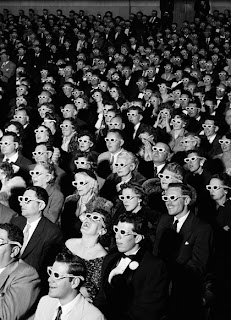
get out your 3D glasses to enjoy the full effect!


No comments:
Post a Comment