Showing posts with label Lava Lounge. Show all posts

Saturday, 17 June 2017

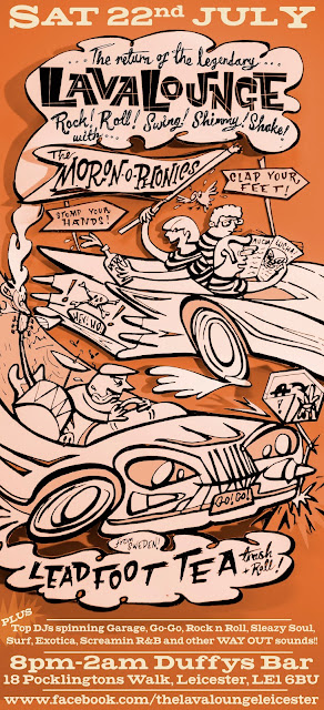
Leadfoot Lee Tea and the Moron-o-Phonics

The Lava Lounge is back and it's time for some more paper-cut illustration! One-man-band Leadfoot Tea is a car nut so this is a tribute to gasser's and grease monkeys, with a hint of wacky races too.
Scrawling out then cutting out the two cars, layering them up to create some shadows and re-photographing them gives the image a more 3 dimensional feel and makes more sense of the original cluttered composition. Pedal to the metal, I've got to burn some rubber!!!

Tuesday, 26 March 2013

Obscuritones poster


A poster for a female fronted rockabilly band, inspired partly by my love of vinyl, and partly by this picture of one of my guitar heroines, queen of trash rock n roll, Poison Ivy Rorschach:


Although the Ivy looks way more badass than my girl, I like to think my girl's sweet on the surface and savage underneath. For the background texture, I used the endpaper from my copy of 'Kon Tiki and I' by Erik Hesselburg, a sketchbook from the Kon Tiki expedition. I layered this up with print-textured colourblocks, and used negative space type to ring the changes. The colours used in the central illustration are complemented by the black line drawing detail in the heart.

MFC Chicken in sickly neon.

A bright one this time! MFC Chicken are named in honour of a fried chicken shop, and this was my take on fast food neon signs. Using a found image of a sexy lady devouring a bucket of chicken, overlaid with a pair of green dancing cocks (thats cockerals, you smutbags out there!) penned by me. I used translucent layers and a print style moire on the background to create a screen printed look.


I found the image for the background by googling 'sexy chicken'. I never want to do that again.

Crazy Japanese R&R poster

This poster was for a gig by the Minnesota Voodoo Men, who, logically, are from Japan. One of the crop of wild wild Japanese garage rock n roll bands that are well worth checking out. The gig was a collaboration with the nice folks who run the very excellent FratHouse club night in Bristol. I wanted the poster to be a tip of the hat to the Screamin' Jay Hawkins-esque brand of American Voodoo in the way that the Minnesota Voodoo Mens' sound is a tribute to trashy 60s American R&R. I included potions, a monkey paw, chickens head, voodoo doll and other paraphernalia of any self respecting 60s american witchdoctor.  I kept the colours muted so the black and white pic of the band didn't look out of place.


Wednesday, 6 July 2011

Be a Caveman!

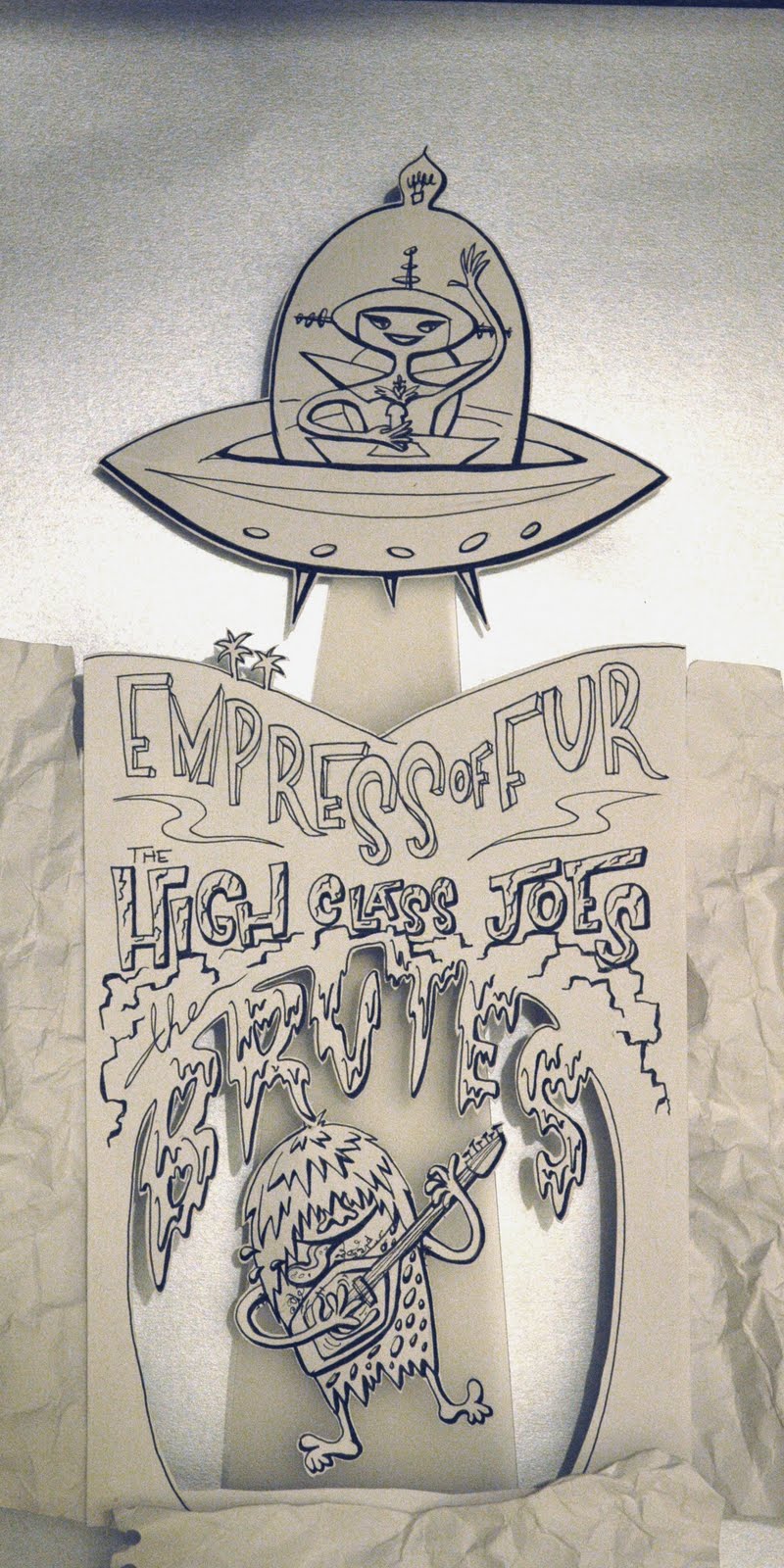
The Lava Lounge this month has a time-travelling spaceage/stoneage theme, and as with the last poster for Glasgow garage band The Brutes I decided a low-tech cut paper approach. This uses a variety of monochrome tones to give a charming semi 3D look. I wanted the vox-strumming neanderthal to look like he was being beamed up to the UFO and used a strip of frosted plastic to get this effect. I also wanted to use stalactites to spell out the name of the Brutes, and hand lettered the band names before adding the rest of the text digitally. 

The parts were drawn out separately and propped in position with crumpled paper forming the rocks of the cave. Reflective silver card makes the spacey background, all carefully lit to get the right shadows and highlights.

Some of the component parts:

Here is the assemblage before a bit of tweaking in Photoshop:
This poster was printed pretty big (20x60cm) for maximum legibility. 

Tuesday, 29 March 2011

Second letterpress poster

More letterpress, and this time I ran the posters up without using the computer at all, just a combo of woodblock and linocut. Very suitable for these bands, who shun modern equipment and take their inspiration from the wild sounds of the 50s and 60s. Thee Ludds are also named in honour of local boy Ned Ludd, who as leader of the luddites led an anti-technology machine smashing revolt. You can sometimes get good results from doing things the old way! (or smashing things up)
Keeping the layout simple, I arranged the text in straight blocks, and added graphic elements cut from lino, managing to slice my fingers to shreds in the process. There's probably a fair dose of blood in that red ink! The ground of ultra-cheap, nicely textured brown parcel paper means I could use white for some of the text, as well as the vivid red and strong black, creating a poster that stands out when seen alongside all the digital prints on white paper that it was vying for attention with. 
        The surface crazing and wood grain on the old type blocks adds more texture, creating a lovely varied, tactile surface rather than a dull, flat, digitally perfect one. The pressure from the press also meant that the letters were very slightly recessed, adding another layer of interest to the surface of each poster.

For a long poster I set up the type in two chases, packing everything in tightly with wooden blocks and quoins, apart from the 'footstompers' text, which I left free to slide up and down to give movement to this line. Printing the text first, with a different run for each colour, I left spaces for the lino graphic of musical notes dancing around a spinning record. Each poster is subtly different, with a different arrangement of red, black and white, and some with white stripes rolled across the image to highlight the band names. 

The oil based inks give the text a nice sheen and give great thick coverage, although they're a bugger to clean up after using!



Thursday, 24 March 2011

Letterpress Poster

A foray into the wonderful world of woodblock here, using a vintage press and an assortment of chunky wooden type. 

I love the look of woodblock type. This trad printing technique was disappearing, with printers throwing out drawers of the stuff when newer techniques took over. Luckily, some folks collected up what they could, and I got to use some blocks that had been saved from the skip, with a heavy duty press to run them through, as well as the rest of the strangely named kit: quoins, chases, reglets etc.
      With a bit of careful arranging, test printing, padding, printing again, tweaking and printing again on various kinds of paper, I got the kind of result that would be hard to replicate with digital techniques alone. But talk about time-consuming - phew! It took me about 4 evenings of messing around to get something I could use. No wonder wood is out, and pixels are in. 
The prints above are some of these experiments. In the end, good old newsprint got the best result from this set-up, as due to the slightly uneven heights of some of the letters in this very old set, thicker paper didn't make enough contact with some of the blocks to make an even print. I played around with different graphics, including the swami and cobra idea above (another good 1950s film cliché), before settling on an advertising character from a restaurant chain and some hand lettering to digitally complete the poster. 
Just look at the end-grain on those letters. Mmmmm. 
Below is part of the set of type used in this poster, which is probably twice as old as I am.


DC Fontana Poster

The blocks of colour on this one are lifted from that most influential/ripped-off of designers, Saul Bass. His era-defining style used simple, powerful layouts, often features bold geometric shapes jostling for position, a style that suited this smart but lively band. The colours were kept limited so that this design could easily be transformed into a screenprint, and the snake spot illustration is for the 'snake charmer' song by these modernist movers. 

Wednesday, 23 March 2011

Mods VS Rockers showdown!

This poster was done for a battle of the bands: rock n rollers Hipbone Slim and the Knee Tremblers VS mod beatsters The Kneejerk Reactions. It's secretly the same band in 2 different guises, playing 2 different sets.
This was also used as a T-shirt design for the band: shown here modeled by an anonymous lovely bearded lady:
A battle of the bands album with my illustration as part of the design may be in the pipeline too, watch this space.

Poster for The Brutes

And this time a foray into the world of paper cuts. To give my illustration a slightly more three dimensional appearance, whilst still maintaining a naive, cartoon-like look, I got out my scalpel.  Photographing the cut-out elements set up as one scene, carefully lit to control the shadows, added subtle variations of tone and increased the interest in this simple, nearly monochrome design.

Here you can see the scale of the volcano and figures, and the initial photo before digital touching-up. I'm not sure if the hairy fella is a go-go gorilla, or numbskull neanderthal, but either way, the primitive beats of the Brutes have got him blowing his top! Will hopefully be adapted as a Brutes tee in the near future?

assorted Lava Lounge promo

Another set of poster/flyer designs for the Lava Lounge using found images.

Monday, 21 March 2011

Doktor Combover poster

This poster was done for the first Leicester visit of sax-blowing sleaze-merchants Doktor Combover. Their brand of greasy strip-club grind was crying out for a seedy illustration to accompany it, and rather a regular nudie lady I thought I should put a hairy lovely in the thinning wig of a hot and bothered fella. The poster was finished with hot pink, with some brush strokes for background texture. The rough sketch looked like this:
And after re-drafting, dropping in the colours and adding text, the final poster looked like this:


Tuesday, 15 March 2011

3D screenprint

An action packed design here from 2007, and a foray into screenprinting. The Loughborough University School of art, next door to my workplace, had a print making department under the guidance of the great Dave Gibbs, who helped me out of hours to make up a screen to print a run of blue and magenta B-movie-tastic 3D posters.
Unfortunately, these lurid lovelies did not transform well into a small digital image so the version for online promotion was left in a sea-scum brown:
I wanted the background to be a mass of curving lines and detail, full of characters on one side such as a giant bespectacled octopus chasing a surfing fink, offering beer to a fish and stealing a mermaids brassiere, to reflect the surf sounds of the bands in the first arrow. The bands in the arrow on the second side have more of a tuff garage vibe, so this one points to a man in beatle boots opening up a can of 'whoop ass' on a little smoking fellow, giving him a swift kick in the behind, like the jolt from a seeing a great energetic band. The arrows make the band names stand out and are an element often found on those super early stereo record sleeves.
 First of all I registered the prints with too much space between the cyan and magenta colours:
but got it right after a bit of trial and error:
here's the finished print modeled by our local luchadore el Lapiz Loco:

get out your 3D glasses to enjoy the full effect!


Hipbone Slim and the Knee Tremblers

So I found an LP with a lovely cover in Oxfam, used half of it for this poster and added a little illustration inspired by a dovells record sleeve. Later seen on the Kneetremblers inner sleeve for their Voodoo-Rhythm rock n roll riot: 'The Sheik Said Shake'  

Monday, 14 March 2011

Egyptian Shumba

A new logo for the lava lounge and an Egyptian reed-pen on papyrus job in tribute to all girl-garagers the Cleopatras

Martini time

A 2007 flyer for the Lava Lounge: the 9th edition of the night and the first time I get to use 'Tittyshaker' on a flyer.

Vintage Lava Lounge: 2006/2007

Some of my flyer designs using found imagery done for the best club night in Leicester: the Lava Lounge