Tuesday 29 March 2011

Second letterpress poster

More letterpress, and this time I ran the posters up without using the computer at all, just a combo of woodblock and linocut. Very suitable for these bands, who shun modern equipment and take their inspiration from the wild sounds of the 50s and 60s. Thee Ludds are also named in honour of local boy Ned Ludd, who as leader of the luddites led an anti-technology machine smashing revolt. You can sometimes get good results from doing things the old way! (or smashing things up)
Keeping the layout simple, I arranged the text in straight blocks, and added graphic elements cut from lino, managing to slice my fingers to shreds in the process. There's probably a fair dose of blood in that red ink! The ground of ultra-cheap, nicely textured brown parcel paper means I could use white for some of the text, as well as the vivid red and strong black, creating a poster that stands out when seen alongside all the digital prints on white paper that it was vying for attention with. 
        The surface crazing and wood grain on the old type blocks adds more texture, creating a lovely varied, tactile surface rather than a dull, flat, digitally perfect one. The pressure from the press also meant that the letters were very slightly recessed, adding another layer of interest to the surface of each poster.

For a long poster I set up the type in two chases, packing everything in tightly with wooden blocks and quoins, apart from the 'footstompers' text, which I left free to slide up and down to give movement to this line. Printing the text first, with a different run for each colour, I left spaces for the lino graphic of musical notes dancing around a spinning record. Each poster is subtly different, with a different arrangement of red, black and white, and some with white stripes rolled across the image to highlight the band names. 

The oil based inks give the text a nice sheen and give great thick coverage, although they're a bugger to clean up after using!


Thursday 24 March 2011

Letterpress Poster

A foray into the wonderful world of woodblock here, using a vintage press and an assortment of chunky wooden type. 

I love the look of woodblock type. This trad printing technique was disappearing, with printers throwing out drawers of the stuff when newer techniques took over. Luckily, some folks collected up what they could, and I got to use some blocks that had been saved from the skip, with a heavy duty press to run them through, as well as the rest of the strangely named kit: quoins, chases, reglets etc.
      With a bit of careful arranging, test printing, padding, printing again, tweaking and printing again on various kinds of paper, I got the kind of result that would be hard to replicate with digital techniques alone. But talk about time-consuming - phew! It took me about 4 evenings of messing around to get something I could use. No wonder wood is out, and pixels are in. 
The prints above are some of these experiments. In the end, good old newsprint got the best result from this set-up, as due to the slightly uneven heights of some of the letters in this very old set, thicker paper didn't make enough contact with some of the blocks to make an even print. I played around with different graphics, including the swami and cobra idea above (another good 1950s film cliché), before settling on an advertising character from a restaurant chain and some hand lettering to digitally complete the poster. 
Just look at the end-grain on those letters. Mmmmm. 
Below is part of the set of type used in this poster, which is probably twice as old as I am.


DC Fontana Poster

The blocks of colour on this one are lifted from that most influential/ripped-off of designers, Saul Bass. His era-defining style used simple, powerful layouts, often features bold geometric shapes jostling for position, a style that suited this smart but lively band. The colours were kept limited so that this design could easily be transformed into a screenprint, and the snake spot illustration is for the 'snake charmer' song by these modernist movers. 

Wednesday 23 March 2011

Outlandish Cocktails part 2

The second part of my set of cocktail illustrations. After the Zombie, Hurricane and Scorpion Bowl, I thought I'd pay tribute to the boozy delights of the Blue Hawaiian, Dirty martini, Suffering Bastard and Headhunter. Most of these weird and wonderful concoctions were at the height of their popularity between the 40's and 60's, which suits my style perfectly. Keeping a different, defined colour scheme for each one, and arranging the elements around a central vessel keeps the set unified. This set of prints was turned into a hardbound, boxed recipe book, complete with 3D diorama under a clear window at the bottom of the box. Unfortunately, this one-off sold at the Leicester City Gallery open exhibition and I didn't even take a photo of it. If you bought it, get in touch, I want pictures!  

Some details of the 'Blue Hawaiian' pen and ink drawing


Some details of the 'Headhunter' pen and ink drawing


Some details of the 'Dirty Martini' garbage pile.


A detail of that hangover.

Prints of all my outlandish cocktail recipes are available now! Get in touch if you want one!

Mods VS Rockers showdown!

This poster was done for a battle of the bands: rock n rollers Hipbone Slim and the Knee Tremblers VS mod beatsters The Kneejerk Reactions. It's secretly the same band in 2 different guises, playing 2 different sets.
This was also used as a T-shirt design for the band: shown here modeled by an anonymous lovely bearded lady:
A battle of the bands album with my illustration as part of the design may be in the pipeline too, watch this space.

Poster for The Brutes

And this time a foray into the world of paper cuts. To give my illustration a slightly more three dimensional appearance, whilst still maintaining a naive, cartoon-like look, I got out my scalpel.  Photographing the cut-out elements set up as one scene, carefully lit to control the shadows, added subtle variations of tone and increased the interest in this simple, nearly monochrome design.

Here you can see the scale of the volcano and figures, and the initial photo before digital touching-up. I'm not sure if the hairy fella is a go-go gorilla, or numbskull neanderthal, but either way, the primitive beats of the Brutes have got him blowing his top! Will hopefully be adapted as a Brutes tee in the near future?

assorted Lava Lounge promo

Another set of poster/flyer designs for the Lava Lounge using found images.

More festival fun...

This time for Lose Your Cool 2010 in Leicester, and again, a gross-out eye-catching colour scheme was called for, lots of drool and exploding brains. 

Monday 21 March 2011

Blast Off! Festival poster and flyers.

Here's a follow up to the BlastOff! Web site I posted a little while ago. 
This poster followed the same colour scheme of orange and blue, with the festival logo and listings hand lettered. After going through a whole load of alternative layouts and ideas, I decided on a very literal image, with the rocket flames showing off the line-up, and the extra details swirling around the surface of a psychedelic planet below. The names of the main bands are almost the size of the festival logo, for maximum legibility, with an upward sweep running through the design, giving the composition some thrust. Because the bulk of the poster was taken up with this important feature, the go-go girls and compere had to be dropped in in a small 1950s style font (brush script), which means you may have to squint a bit to read their fabulous names.
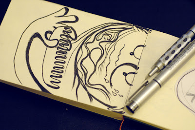
The poster was drafted at full size (A3) with a 0.1 fineliner giving the necessary detail.(Shown below next to another key piece of kit for scrubbing out scribbles: the Rowney Mystic eraser. What mystic means I don't know but it sounds like there's magic in that there rubber. Can't be bad!)
In the dark blue surround I added interest with a selection of spacey stuff, UFO's, astronauts, spacegirls packin' ray guns, the robot monster playing a Vox Phantom, basically all the B-movie clichés I could cram in.


This design was adapted for flyers too, with some of the information removed from the front and more added to the back, along with a few of the choice spot illustrations also used on the web, to add a visual balance to all that writing. 
The posters and flyers made it half way round the world, to France, Spain, Portugal and one sighted a couple of years later on the wall of Caffeine Sound recording studio in Sao Paulo. See if you can spot it here. Must be something to do with that magic eraser!

Doktor Combover poster

This poster was done for the first Leicester visit of sax-blowing sleaze-merchants Doktor Combover. Their brand of greasy strip-club grind was crying out for a seedy illustration to accompany it, and rather a regular nudie lady I thought I should put a hairy lovely in the thinning wig of a hot and bothered fella. The poster was finished with hot pink, with some brush strokes for background texture. The rough sketch looked like this:
And after re-drafting, dropping in the colours and adding text, the final poster looked like this:


Sunday 20 March 2011

Los Coyotemen

A poster for Los Fabulous Coyotementhe greatest four man tag team rock 'n roll combo North, South, East and West of the sacred squared circle. The rampaging wrestler is stomping over Madrid, where the shows were, can of ace lager in hand. Space left at the bottom for the show details.

Friday 18 March 2011

T-shirt design for Thee Cruellas

A quick logo for Thee Cruellas, Leicesters greatest girl garage goofs. Sadly no more. Note the humpin' hound at the bottom, in tribute to bass player Julies shaggy dog, Candy.

Outlandish Cocktails

Well, I got given a bar for our front room by a friend, who said it used to belong to one of the Meteors. Having this boozy little slice of cocktail-shaking heaven in my home 'unfortunately' forced me to revisit all those lethal cocktails with weird, evocative names, and after leafing through a copy of beachbum berry's grog log, I was inspired to do a set of prints. I was also inspired by my complaining liver, which suggested I should find something to keep me away from the rum for a while. It didn't work. Hic.
 Here are the first 3:


Blast Off! Festival website

In 2009 I was one of the organisers of Blastoff! Festival, so it was only logical that I did the artwork too. The festival was a 3 day blast of garage and rock n roll, with some amazing bands such like The Oblivians and The Gories. For the early promo I used the eye-melting combination of orange and blue from the 'Soul Food' album, and drew up some retro-futuristic intergalactic graphics.
I also created the artwork for the website, this time with more blue than orange so you could actually read the thing. Working from sketches and hand-lettering the headings, I transformed them into vectors for a slightly slicker appearance (after all, digital technology is the future today!).

The finished pages looked like this:
And for each page I created spot illustrations to break up the text and add a bit of interest.
Which were turned into animated gifs for the website.